Oh, so it’s been a while since my last update about the positioning work, hasn’t it. Hello, all! Still plugging away over here, just a bit focused on this amazing campus event called Inauguration and Owls Fest coming up in a few weeks (10/25-6). Come one, come all!
As you know, we have finalized the visual identity, and have put to bed much of the initial messaging strategy based on our content pillars work. We hosted overview presentations for several offices on campus in late August, and then the semester started!
We’ve gone a little dark so we can concentrate on our soft rollout of the new positioning elements with the Inauguration and Owls Fest event promotion, stage design, and visual look and feel, and then as soon as that is all in the rear view mirror, we’ll return to focusing on a campuswide announcement, the release of a new guidelines website, asset distribution (like the new wordmark/logo), and so much more.
For those of you who have been wondering when you will be getting new toys to play with, it’s coming soon. Please continue to use current logos and other items. If you are ordering larger quantities of an item, please contact me or Emma Bumstead for a consultation first. We will offer specific trainings to those curious about how to use all this work, and will make those widely available.
Next steps also include a proposal to the Board of Trustees to approve at their October meeting our nominal changes to the Historical College Seal, so then we will be ready to rollout the wordmark locked up to the seal in a complete way. The plan… it’s all coming together!
Also…. let’s say you were in the market for a new t-shirt, or hat, blanket, or water bottle… well, do I have exciting new for you.
Now available at Bryn Mawr’s very own Book Shop is a selection of Lantern’s Glow yellow merchandise and additional merchandise with our revised College wordmark/logo! Special thanks to Stephanie, the goddess of merch ordering, for her partnership on getting our revised College yellow and wordmark out into the world via their Book Shop displays. Check it all out next time you are at the Campus Center and take home our new “ownable” Bryn Mawr yellow on something new!
My team has heard some very positive feedback from my initial blog explanations of the new college color palette and other visual identity items as described in previous posts. I am excited that you are excited to get in the game and use these new elements to market your own efforts.
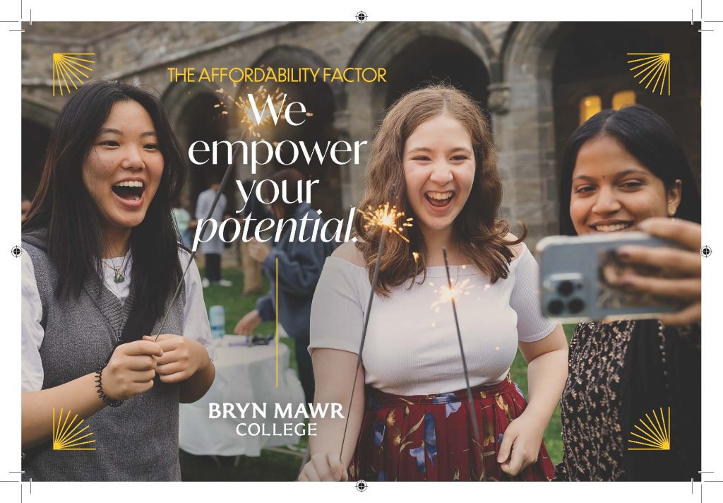
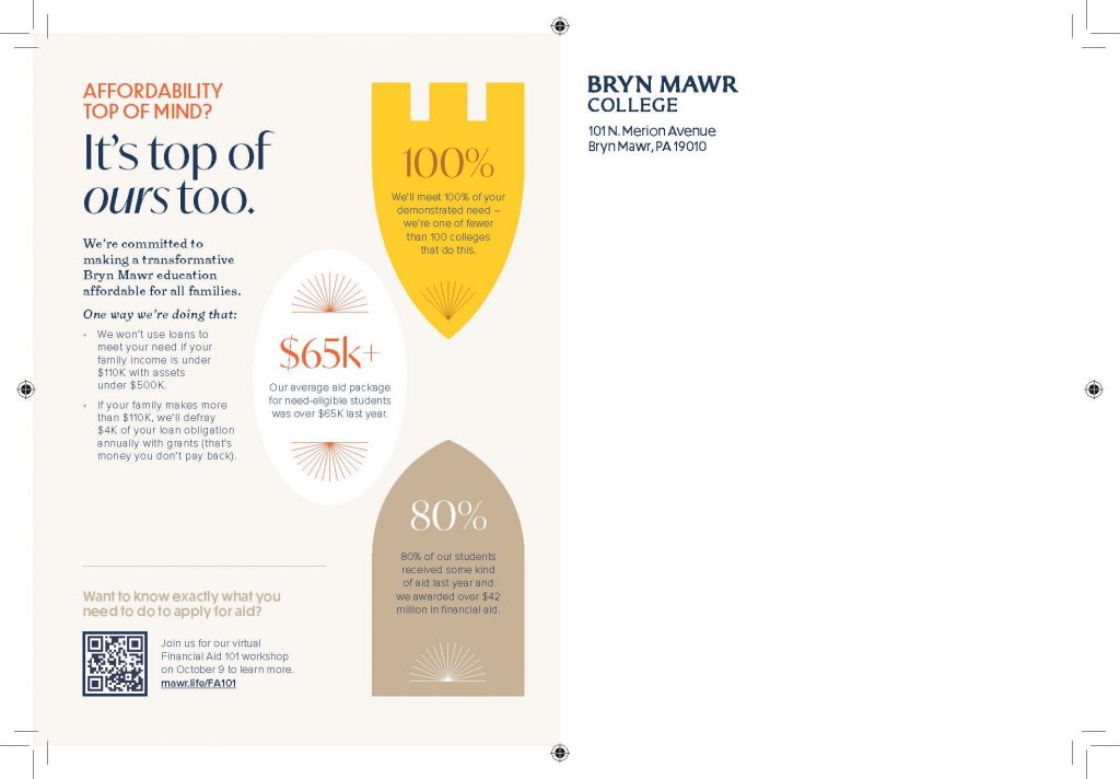
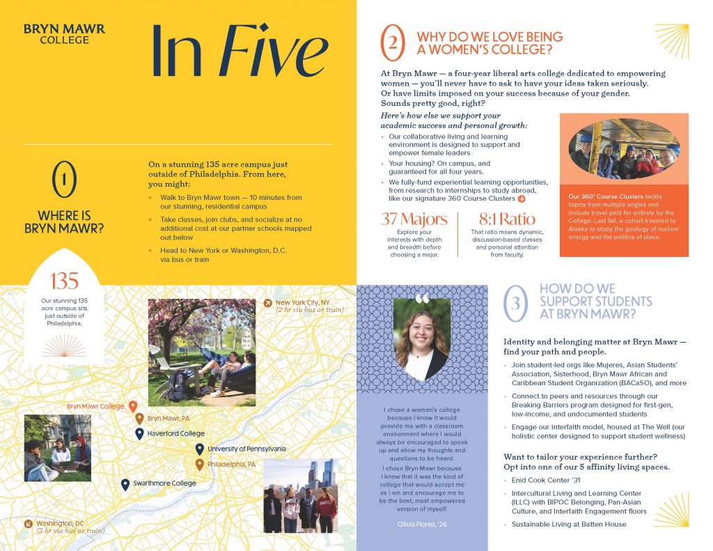
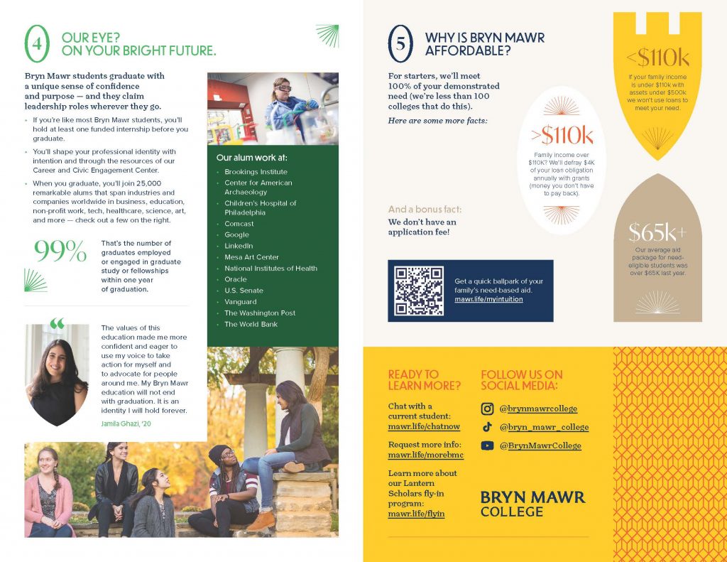
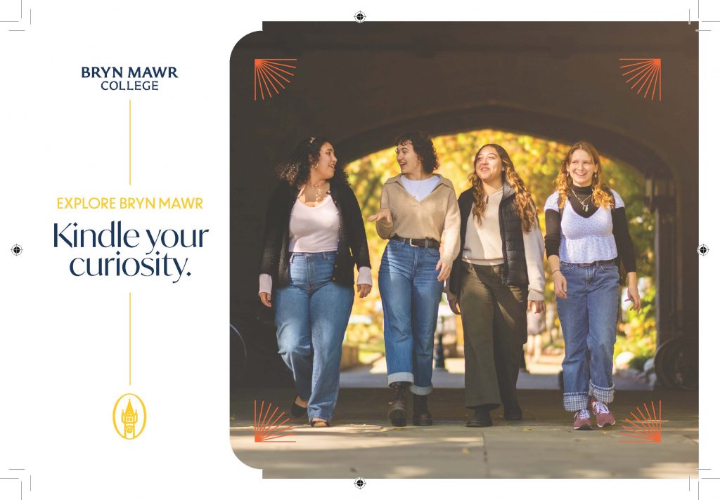
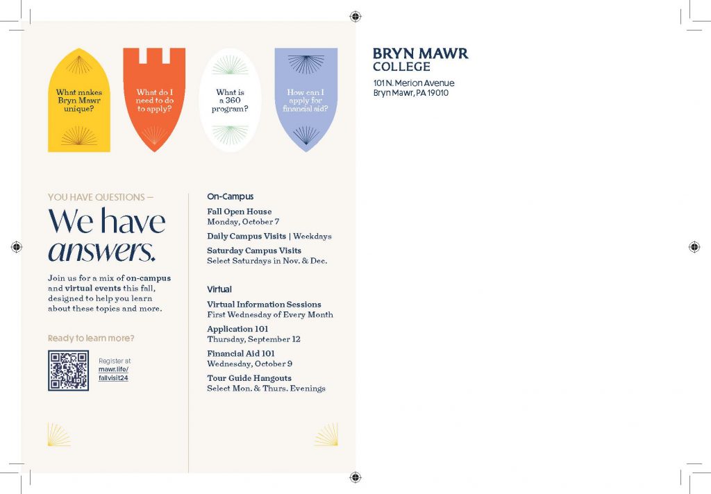
Communications, in partnership with Undergraduate Admissions and SimpsonScarborough, has been working together this summer to apply the new visual identity work to some printed collateral that will soon make its way to schools and prospective students. I thought I would share below some examples, which might appear better on the blog website itself than in your email notification (click the bottom link in your email notice to see each blog post on a web browser.)
You can see the very beginning of our visual evolution through these postcards, handouts and poster. As we use the new elements, we learn more about what “fits” Bryn Mawr College, so it’s all a work in progress.
You will be surprised to learn I am enjoying these early “fruits” of our work on the positioning project, and look forward to more! More updates after the graphics below:
Communications, along with some select staff in other units, are looking forward to our initial training sessions on the visual identity and other areas with SimpsonScarborough at the end of this month. This training will help prepare my team to help train those who need it in how to use the first phase of guidelines we are currently finalizing. We also continue to work with President Wendy on other aspects of the verbal positioning work (messaging) and will update you as that work continues.
Emma Bumstead and Jodee Winger on our Creative Services team are also beginning to design items using the new visual identity for the Inauguration of President Wendy on October 26th (everyone is invited so mark your calendar!)… You’re going to see a whole new look and feel for that celebration and its related two-day event, Owls Fest.
Meanwhile, in case you missed the announcement in the Daily Digest a few weeks ago, we have an official new name for the college’s athletics mascot! Their name is Olympia, Olly for short, and we’re excited to design a new costume befitting this symbol of leadership and college pride. Lots more on that in the months to come.
And lastly, for those who haven’t heard the news, our college photographer/videographer, Aaron Windhorst, left the college last month to pursue his MFA more full-time. We have posted the position, and greatly appreciate your patience while we seek to rehire the role as quickly as possible. Thank you!
Hello, positioning project blog readers. While we await thunderstorms on campus, I thought it would be a good time to discuss a sunnier topic: we have a new color palette!
Some of you might be thinking, “What is our current color palette?” or “What is a color palette?” These are excellent questions. Let’s take a step back first…
Devoted blog readers may recall that I’ve described this project as having two halves—a messaging strategy and a visual identity. While the messaging strategy continues to blossom, we have finalized the major components of the visual identity, which governs the look and feel of our visual communications. This includes graphic design elements as described a few weeks ago.
Back when our current visual identity was created around 2011, a color palette was introduced that gave us two classifications of colors: a primary color list and an accent color list. The primary color list, as the name suggests, should be the most prominent colors used in all official college communications, from posters to brochures. The accent colors should be used sparingly to provide emphasis and visual interest. They are both meant as guidelines to inform color choices in all manifestations of how we express ourselves visually.
But, if you’ve been at the college for more than half an hour, you’ll quickly observe a few things about the current palette:
The primary colors consist of black, two shades of gray, and a pale yellow/beige. But…
However, we have, over time, evolved toward an (over)reliance on the color navy, so much so that when I applied for this job about two years ago, I literally thought the college’s primary colors were navy/blue and white.
The palette also feels a bit cold (this is my subjective opinion) and needs some added warmth.
When this color palette was created, we all were in an earlier stage of digital communications. This was also the very early stages of American communicators caring about the accessibility of our communications. Fast forward to 2024, and there are very specific standards for how outward-facing digital communications should use colors (and many other elements.) We cannot use a light color on top of a darker color without a specific amount of contrast, for example, so that people with disabilities are able to ingest the information properly. So, this means that the lighter yellow in the 2011 palette is all but impossible to use on the college website without using black. We also are concerned about the accessibility and readability of non-digital communications. Certainly, one could not use white on top of the yellow, as even someone without a disability would find it almost impossible to read (like a headline on a printed poster or brochure.) It just means that our current light yellow is not a flexible yellow, and thus, the yellow was dialed down, and the blue was dialed up because it’s frankly easier to use.
Here’s the thing about our color palette, though: our college has official colors. Did you know that? Yes, back at the beginning stages of the college’s development, things like the official college motto, colors, flower, and other symbols like the lantern and the owl were actual decisions made and approved by college leadership. So, what are our official colors? Yellow and white!
Part of the goal of introducing a new color palette in 2024, in addition to adding more warmth and flexibility and ensuring accessibility, was to re-center around our yellow and white identity. This is who we are; it’s a part of our history, and it’s time to reclaim it.
Ok, Samara, just show us the colors already.
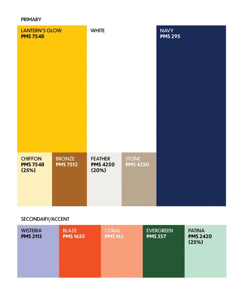
I am pleased to introduce you to our new official college color palette, which will be in effect as of early September when we release the new guidelines for our visual identity and the messaging strategy. Do not feel like you need to start adopting these without further guidance from my team, but this is merely a preview.
Our new official yellow, named “Lantern’s Glow,” is meant to convey the warmth of the light/truth we all seek in our lives as part of the Bryn Mawr community. Shout out to Emma Bumstead, our creative director, who named the color. It plays well as a contrast not only to the white, but also the navy (moved to a primary color instead of black). You’ll also notice we’ve decommissioned gray. We have some accent colors for the primary pallette, and a new suite of secondary accent colors as well.
As our rollout begins in September, you will begin to see my office use our Lantern’s Glow and the rest of the palette. I hope the new colors feel more approachable to you. We tested them with several offices on campus as part of the visual identity creative testing. As always, huge thanks to our positioning partner SimpsonScarborough, who developed the creative phase work with us this year. I can’t wait to start applying these colors to our website this fall in partnership with LITS and to all our other communications products. Remember, new guidelines are forthcoming!
Hello, blog readers. Somehow I blinked and June is almost over… does this happen to anyone else?
I thought I would use today’s update to tell you about an exciting new service we will be implementing hopefully later this year. It has to do with how you access photography depicting the College.
Right now, if you wanted an image of the College campus, of an event, or other official photographs, you’d have to email the College Communications office directly to request it. My guess is that some of you don’t even get that far, preferring to either use Google Images or stock photography or whatever you already have handy. But we can do better!
With the advent of digital technologies, and cloud storage, there is a digital solution available that helps to organize large sets of files and make them easily searchable and retrievable. The name of this technology is called Digital Asset Management, or, because it is always fun to say, a DAM. (Cue the dad jokes.)
There are many DAM solutions out in the marketplace, and many of our peers have implemented these sorts of software options. It essentially makes finding things like photography, and eventually videography, graphic files, etc., so much easier. Also, it means you can self-serve and use a website interface to find what you might need. Lastly, but not least important, some of them surface the organizational structure right in front of you so you can sort of browse folders to window shop, if you like.
Members of our creative services team here in College Communications and I have been researching DAM options, and have landed on a preferred vendor. Once the contract is signed, we will be spending the next several weeks/months uploading lots of images for your browsing pleasure. Once we have a critical mass, we will release access to the database campuswide.
My hope in launching this new service is to improve the visual way we all depict the College when you have the chance to do so. It will also give us a good sense of the holes in our photography coverage, and we will welcome your feedback on areas we can improve on.
In other news, work continues on setting up some training opportunities for late August and fall semester, boilerplate language about the College, and some general messaging guidance. This week, we are launching a boatload of design and writing projects with undergraduate admissions to start applying some of this work to the printed materials the office uses to recruit the incoming class. We will also be looking to our partner SimpsonScarborough to help us position our Master’s in Social Service and attract new applicants. I’ll also be working on a new overview brochure for the College this summer into the fall (because we don’t have one!) And some other things I’ll tell you more about next week.
I hope to see some of you at our second annual College Communications open house today from 12:30-2 p.m at Dolwen House on Cambrian Row. Come meet my team and ask us any communications questions you might have!
Hello everyone. Today is another exciting day for the positioning project, as we are about to cross the finish line on our creative direction. What does this mean?
While we now know the general direction of many visual elements, we will not be receiving specific written guidance on how best to use them until late August. This is commonly referred to as a “brand book.” Ours will not be a printed book though; instead, we will be creating a whole website section dedicated to detailed guidelines and best practices on how you can incorporate the creative direction and strategic messaging in your work. Our hope will be to roll that out early in the fall semester.
We are working on our rollout strategy, and not surprisingly, there are a great many elements that will need to be redesigned in the next few months to help us launch the new creative direction. I ask that if you know you will have any graphic design needs in July, August or September for which you planned to request help from the Office of Communications, please notify us via this form by the end of June. Your advanced planning is greatly appreciated!
This week, Creative Director Emma Bumstead and I met with Trish and Donna in the Controller’s Office to discuss how we will approach redesigning the “punch-out” branded merchandise one can order via E-Market. Items available there include official College business cards, notepads, letterhead, envelopes, labels, and more. We will work to redesign these elements as soon as we can, and will notify staff when the new online marketplace is up and running with revised branded items you can customize.
I also met with Canva, an online graphic-design tool, to see if we could offer that as a resource to departments and offices for a reduced cost who may have more simple graphic design needs and may benefit from easy access to some of the creative direction elements. I’ll be reaching out to individual offices who currently have a paid seat license to see how you use it, but if you have a free account, email us at communications@brynmawr.edu and let me know how you use the software.
We will be receiving graphic files for the revised College wordmark in June! If you need anything printed with the wordmark this summer, please use the form linked above.
This week’s fun fact: Another helpful meeting Emma and I had last week was with Jim and Stephanie at the College Book Shop. They mentioned that alumnae/i will occasionally mention that they are surprised by the spelling of the word “Mawrter” that appears on some of their merchandise. Apparently, it is also spelled “Mawrtyr” as well. I asked Allison, our College archivist, to see if there was an obvious original spelling based on the archives. It turns out that both appear to be correct based on some records from the early 1900s. So, pick your favorite spelling and run with it.
What’s next? We will dive much deeper into the strategic positioning work. We continue to work on some short and long versions of the College’s overview language and other positioning elements. We are also beginning to plan some phase one training modules.
Happy Reunion to those who celebrate, and happy weekend to everyone.
Hello positioning project blog readers! I had a lovely conversation with one of you at Commencement on Saturday (hi Betsy) and it reminded me that, well, it’s been a little busy lately and I owed you all an update on our great progress since my previous update last month. As the saying goes, the show must go on, and so has this project. We have been iterating on a whole series of elements, and I can give you a sample of items that have been decided and some on which we continue to work with SImpsonScarborough.
One note about timing, for those who are curious… we will be finalizing the guidelines for the new visual identity and strategic positioning work in August, which is because we need to pause and change gears next month to complete some very high priority printed materials for undergraduate admissions to launch with their fall recruitment season. There will be lots of training and individualized conversations to help you rollout all the new elements during the next academic year and beyond. We will not be flipping a light switch on this new work, but rolling out as needed elements for everyone’s use.
I do ask that as of Memorial Day, please contact my office if you plan to order anything in large quantities that has a current design so we can work with you.
Creative Concepts and Refreshed Identity Marks
Wordmark: So if you’ve heard me talk about this in person, what many people refer to as our college “logo” is really called a “wordmark” in design because it’s, well, made up of words. And our college wordmark, which was designed and adopted back around 2011, is well loved and evokes the stone architecture of the campus. So while SimpsonScarborough decided not to redesign the wordmark entirely for those reasons, it did need some minor updates. As you will see below, the word “college” on line two appears almost like an afterthought as compared to the “Bryn Mawr” first line. If you have ever tried to use this wordmark, especially in smaller sizes, that size difference renders the word “college” so faintly as to be nearly illegible. This was an important fix with the increasing need to communicate digitally on small screens (think cell phones) and in other formats.
So, after some iteration, we have landed on a revised wordmark. On the left here is the existing wordmark, and on the right is the selected wordmark. A small change, but one that will make its use a lot more flexible. For now, continue to use the existing wordmark, and when we are ready to start rolling out the new one, my office will definitely let you know.
Graphic Elements
So we are still working on finalizing a lot of the visual creative. We are hard at work revising the entire official color palette, so we will all have a fresh slate of colors to choose from when designing things. The key part here is that we are expanding it to include a large variety of colors from which you can choose. I think you’re going to really love it. More on that once it’s all final.
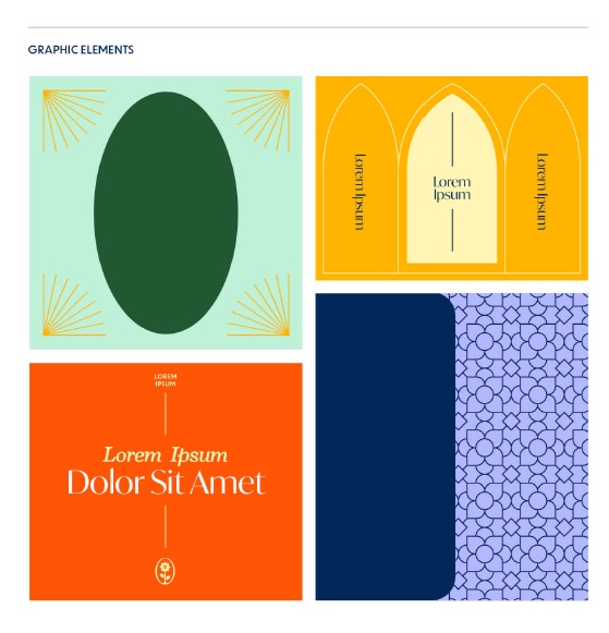
Another one of the aspects of this new visual identity that I really wanted to incorporate was an expanded set of graphic elements to enhance all the items our office designs on behalf of the college. Colors are lovely, but alone they only get you so far. How can we give specific posters, or postcards, or even the entire website a bit of its own personality while staying within an overall positioning identity so everything still feels… Bryn Mawr-ish?
I’m excited to show you four concepts from SimpsonScarborough that we will be carrying forward in this vein… lots more usage guidelines to come.
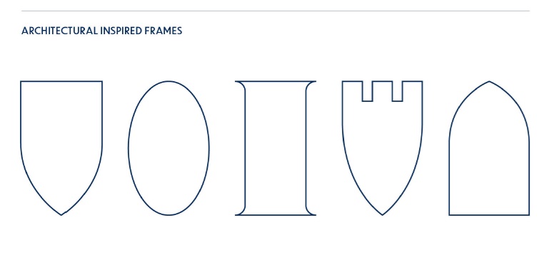
These new frame shapes we will use to insert photos, graphics, textures, or other elements, in between your usual squares and rectangles… inspired by our campus architecture…
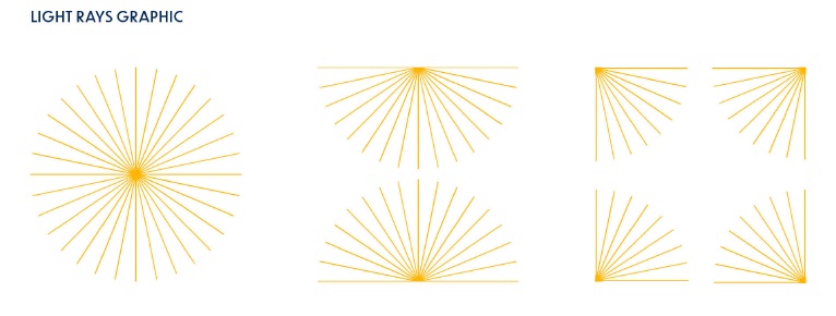
Keeping in mind our general motif of light, these graphics will represent our lantern light from all directions…
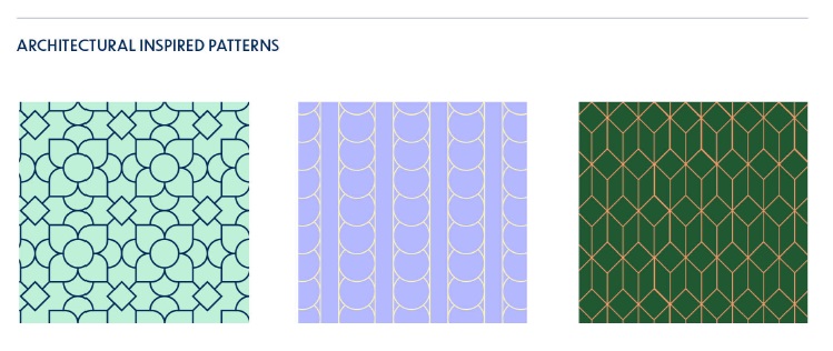
A third element that will also be very useful also ties into our campus architecture… new patterns… someday we’ll do a small contest on what inspired some of these patterns, but we’re happy for new nominations if you spy something on campus that could work in the future!
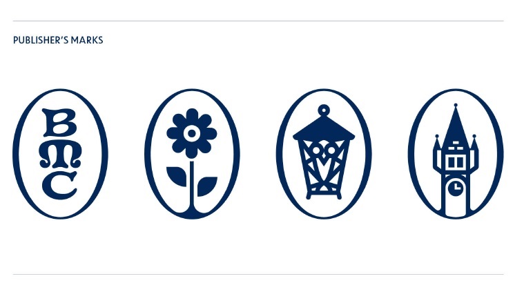
And a fourth element are what we call Publisher’s Marks, which represent iconic elements of our campus. A few notes about this set: 1) The traditional BMC monogram many of you have seen before will be retired with the release of our new guidelines this summer. Our new monogram below will not entirely replace the old one, as this will be used differently (and sparingly.) 2) Did you know the college has an official flower? It’s the daisy. 3) The Lantern that we all know and love in an icon form 4) Taylor Hall’s bell tower. We’ll also happily take nominations of other iconic parts of our campus for future marks.
So how will these all work together? Here’s a few mock-up examples (and a small color palette preview!)
Excited yet??
What else
Other elements we have also been working on include some new directions for photography, typography (fonts), and a new tagline concept. I am also working with SimpsonScarborough on some new standard language that describes the college, as well as some content planning to bring some of the positioning concepts to life.
It’s not dull here in positioning land.
But alas, it’s time for another meeting, so I’ll have to update you more after the holiday weekend. Thanks as always for your continued interest in the project.
Our work continues on the creative identity front. In addition to the on-campus discussions held earlier in April with 60 participants, SimpsonScarborough completed their national external “pulse” work with 300 respondents to garner additional feedback from likely applicants and their families. So as described last update, we were testing two different creative directions that included visual direction ideas (fonts, colors, textures, and more) and also some verbal narrative to match.
Research questions included the following:
Which concept maximixes appeal, enhances recall, inspires action, and is most liked by audiences?
Which concept best expresses the positioning pillars (culture and values)?
Which concept appeals most to those considering a women’s college?
Which concept has the most distinct and ownable visuals? Most distinct and ownable voice?
The biggest finding from the external stakeholders was that both concepts were appealing to those already considering a women’s college. (Whew!) However, their concept called “First Edition” leads across all key metrics for external audiences—both those interested in a women’s college and those not— and more people said there was nothing they disliked. Both the messaging and design of First Edition have elements of great appeal, including its eye-catching colors, bright photography, and overall joyful and optimistic tone.
For internal audiences (students, faculty, staff, alumnae/i,) both concepts felt authentic. But they were drawn to the graphic elements and color in the visual expression of First Edition and the ownable language and energy of the verbal expression of the second concept, “Seeking Illumination,” in particular.
So as a result, we will be moving forward with the best of “First Edition” and adding in some of the verbal language and visual concepts from the second concept. And then further refine it all.
I get this is all abstract unless you participated in the on-campus conversations and have seen the conceptual work… but I will definitely share more details as we bring it all together.
As you know, this week we welcomed four representatives from SimpsonScarborough to present round two of our creative directions and identity marks. Their days were busy, speaking with senior staff members, representatives from various offices across campus, alumnae/i, undergraduate students, and graduate students. The discussions and feedback were fruitful as SimpsonScarborough prepares to test the two creative directions soon with a national audience of likely applicants and applicant families to see how they might resonate. A hearty thank you to all those who participated. We’ll be getting the results of all this testing and chatting later in April, and I will report back then.
Our Wednesday night dinner with undergraduates yielded robust discussions.Our virtual alumnae/i discussion also did not disappoint. I hope the cat enjoyed it too. (I know it’s a still image, but maybe it was in the room?)
Just a brief invitation this week for faculty/ staff to sign up for next Wednesday’s on-campus presentation from SimpsonScarborough to learn about the most recent versions of our creative concepts. (Last week’s post better explains the details.) Thanks to those who have signed up already!
Faculty/Staff Creative Positioning presentation Wednesday, April 3 2:30 p.m. – 3:30 p.m. RSVP to info@brynmawr.edu Light refreshments will be offered
Otherwise, next week SimpsonScarborough will be meeting with several other campus constituencies to discuss the creative concepts, and then the concepts will be tested with a national audience of likely prospective students and families. We’ll get lots of feedback before selecting a single creative direction and ensure it resonates the way we want it to.
Hello again, blog readers! It’s been a couple of weeks since my last update and a lot has happened since then. One, I was on vacation last week, and two, we launched the third phase of the positioning project.
On Monday, March 18th, we received the first round of work for our creative concepts and related materials. This work includes quite a lot of deliverables and SimpsonScarborough has been clearly very busy.
Items we are reviewing include the following…
We are reviewing potential changes to make our college wordmark/logo more legible at any size, especially smaller sizes, and in all use cases.
We are developing a common structure for the design of wordmark/logos for academic units as well as some college units.
We are exploring a refresh the design of our college seal for legibility/scalability while retaining many of the unique historical elements (this will take Board of Trustees approval).
And we are reviewing two early concepts for creative directions we can follow for the look and feel of our materials moving forward. This is perhaps the part many people find the most fun, where we explore a unifying theme behind items such as textures, fonts, colors, photography style, and more.
Our assessment of these items includes not only our personal opinions, but also more importantly, what the concepts and designs are communicating and what will resonate with our key audiences on and off campus.
As previously mentioned, SimpsonScarborough is returning to campus to present about the above items on April 3 and 4 and take questions. Faculty and staff are invited to participate and I am offering first chance at seats to you, dear blog readers. We will be only hosting an in-person meeting, though, in the Old Library London Room. Please join us!
Faculty/Staff Creative Positioning presentation Wednesday, April 3 2:30 p.m. – 3:30 p.m. RSVP to info@brynmawr.edu Light refreshments will be offered