Hello, positioning project blog readers. While we await thunderstorms on campus, I thought it would be a good time to discuss a sunnier topic: we have a new color palette!
Some of you might be thinking, “What is our current color palette?” or “What is a color palette?” These are excellent questions. Let’s take a step back first…
Devoted blog readers may recall that I’ve described this project as having two halves—a messaging strategy and a visual identity. While the messaging strategy continues to blossom, we have finalized the major components of the visual identity, which governs the look and feel of our visual communications. This includes graphic design elements as described a few weeks ago.
Back when our current visual identity was created around 2011, a color palette was introduced that gave us two classifications of colors: a primary color list and an accent color list. The primary color list, as the name suggests, should be the most prominent colors used in all official college communications, from posters to brochures. The accent colors should be used sparingly to provide emphasis and visual interest. They are both meant as guidelines to inform color choices in all manifestations of how we express ourselves visually.
But, if you’ve been at the college for more than half an hour, you’ll quickly observe a few things about the current palette:
- The primary colors consist of black, two shades of gray, and a pale yellow/beige. But…
- However, we have, over time, evolved toward an (over)reliance on the color navy, so much so that when I applied for this job about two years ago, I literally thought the college’s primary colors were navy/blue and white.
- The palette also feels a bit cold (this is my subjective opinion) and needs some added warmth.
- When this color palette was created, we all were in an earlier stage of digital communications. This was also the very early stages of American communicators caring about the accessibility of our communications. Fast forward to 2024, and there are very specific standards for how outward-facing digital communications should use colors (and many other elements.) We cannot use a light color on top of a darker color without a specific amount of contrast, for example, so that people with disabilities are able to ingest the information properly. So, this means that the lighter yellow in the 2011 palette is all but impossible to use on the college website without using black. We also are concerned about the accessibility and readability of non-digital communications. Certainly, one could not use white on top of the yellow, as even someone without a disability would find it almost impossible to read (like a headline on a printed poster or brochure.) It just means that our current light yellow is not a flexible yellow, and thus, the yellow was dialed down, and the blue was dialed up because it’s frankly easier to use.
Here’s the thing about our color palette, though: our college has official colors. Did you know that? Yes, back at the beginning stages of the college’s development, things like the official college motto, colors, flower, and other symbols like the lantern and the owl were actual decisions made and approved by college leadership. So, what are our official colors? Yellow and white!
Part of the goal of introducing a new color palette in 2024, in addition to adding more warmth and flexibility and ensuring accessibility, was to re-center around our yellow and white identity. This is who we are; it’s a part of our history, and it’s time to reclaim it.
Ok, Samara, just show us the colors already.
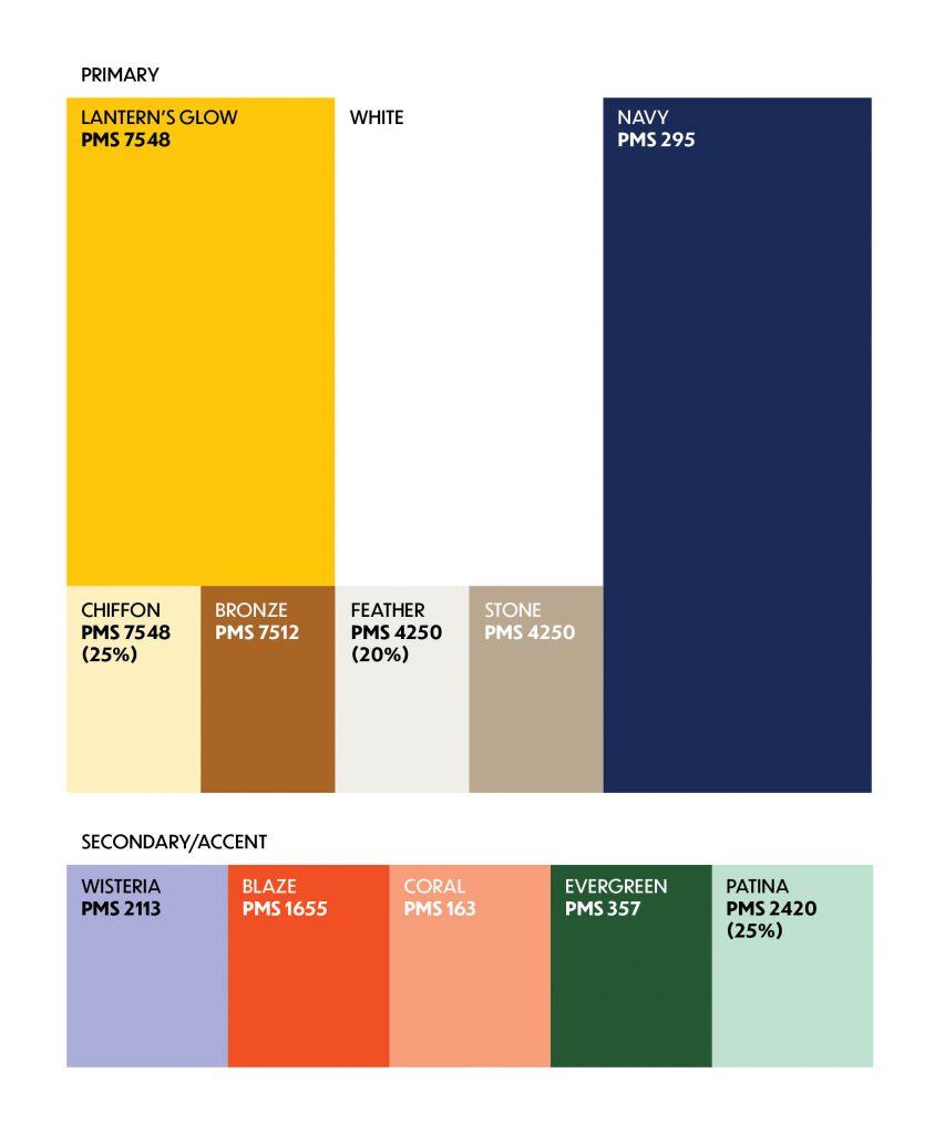
I am pleased to introduce you to our new official college color palette, which will be in effect as of early September when we release the new guidelines for our visual identity and the messaging strategy. Do not feel like you need to start adopting these without further guidance from my team, but this is merely a preview.

Our new official yellow, named “Lantern’s Glow,” is meant to convey the warmth of the light/truth we all seek in our lives as part of the Bryn Mawr community. Shout out to Emma Bumstead, our creative director, who named the color. It plays well as a contrast not only to the white, but also the navy (moved to a primary color instead of black). You’ll also notice we’ve decommissioned gray. We have some accent colors for the primary pallette, and a new suite of secondary accent colors as well.
As our rollout begins in September, you will begin to see my office use our Lantern’s Glow and the rest of the palette. I hope the new colors feel more approachable to you. We tested them with several offices on campus as part of the visual identity creative testing. As always, huge thanks to our positioning partner SimpsonScarborough, who developed the creative phase work with us this year. I can’t wait to start applying these colors to our website this fall in partnership with LITS and to all our other communications products. Remember, new guidelines are forthcoming!
Stay dry out there and enjoy your weekend.
