Hello positioning project blog readers! I had a lovely conversation with one of you at Commencement on Saturday (hi Betsy) and it reminded me that, well, it’s been a little busy lately and I owed you all an update on our great progress since my previous update last month. As the saying goes, the show must go on, and so has this project. We have been iterating on a whole series of elements, and I can give you a sample of items that have been decided and some on which we continue to work with SImpsonScarborough.
One note about timing, for those who are curious… we will be finalizing the guidelines for the new visual identity and strategic positioning work in August, which is because we need to pause and change gears next month to complete some very high priority printed materials for undergraduate admissions to launch with their fall recruitment season. There will be lots of training and individualized conversations to help you rollout all the new elements during the next academic year and beyond. We will not be flipping a light switch on this new work, but rolling out as needed elements for everyone’s use.
I do ask that as of Memorial Day, please contact my office if you plan to order anything in large quantities that has a current design so we can work with you.
Creative Concepts and Refreshed Identity Marks
Wordmark: So if you’ve heard me talk about this in person, what many people refer to as our college “logo” is really called a “wordmark” in design because it’s, well, made up of words. And our college wordmark, which was designed and adopted back around 2011, is well loved and evokes the stone architecture of the campus. So while SimpsonScarborough decided not to redesign the wordmark entirely for those reasons, it did need some minor updates. As you will see below, the word “college” on line two appears almost like an afterthought as compared to the “Bryn Mawr” first line. If you have ever tried to use this wordmark, especially in smaller sizes, that size difference renders the word “college” so faintly as to be nearly illegible. This was an important fix with the increasing need to communicate digitally on small screens (think cell phones) and in other formats.
So, after some iteration, we have landed on a revised wordmark. On the left here is the existing wordmark, and on the right is the selected wordmark. A small change, but one that will make its use a lot more flexible. For now, continue to use the existing wordmark, and when we are ready to start rolling out the new one, my office will definitely let you know.

Graphic Elements
So we are still working on finalizing a lot of the visual creative. We are hard at work revising the entire official color palette, so we will all have a fresh slate of colors to choose from when designing things. The key part here is that we are expanding it to include a large variety of colors from which you can choose. I think you’re going to really love it. More on that once it’s all final.
Another one of the aspects of this new visual identity that I really wanted to incorporate was an expanded set of graphic elements to enhance all the items our office designs on behalf of the college. Colors are lovely, but alone they only get you so far. How can we give specific posters, or postcards, or even the entire website a bit of its own personality while staying within an overall positioning identity so everything still feels… Bryn Mawr-ish?
I’m excited to show you four concepts from SimpsonScarborough that we will be carrying forward in this vein… lots more usage guidelines to come.
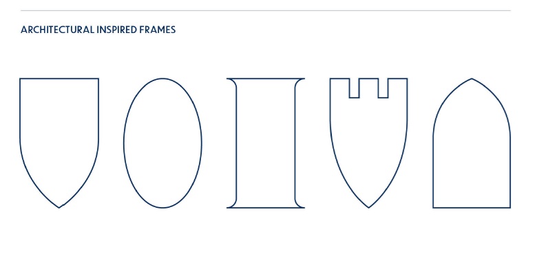
These new frame shapes we will use to insert photos, graphics, textures, or other elements, in between your usual squares and rectangles… inspired by our campus architecture…
Keeping in mind our general motif of light, these graphics will represent our lantern light from all directions…

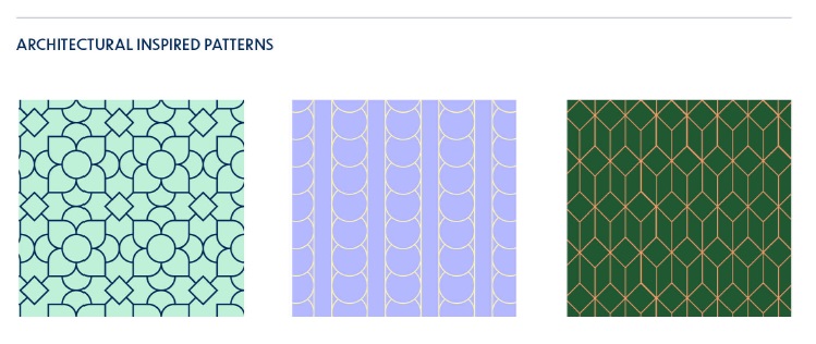
A third element that will also be very useful also ties into our campus architecture… new patterns… someday we’ll do a small contest on what inspired some of these patterns, but we’re happy for new nominations if you spy something on campus that could work in the future!
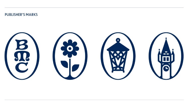
And a fourth element are what we call Publisher’s Marks, which represent iconic elements of our campus. A few notes about this set: 1) The traditional BMC monogram many of you have seen before will be retired with the release of our new guidelines this summer. Our new monogram below will not entirely replace the old one, as this will be used differently (and sparingly.) 2) Did you know the college has an official flower? It’s the daisy. 3) The Lantern that we all know and love in an icon form 4) Taylor Hall’s bell tower. We’ll also happily take nominations of other iconic parts of our campus for future marks.
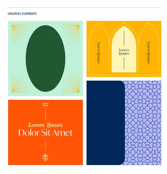
So how will these all work together? Here’s a few mock-up examples (and a small color palette preview!)
Excited yet??
What else
Other elements we have also been working on include some new directions for photography, typography (fonts), and a new tagline concept. I am also working with SimpsonScarborough on some new standard language that describes the college, as well as some content planning to bring some of the positioning concepts to life.
It’s not dull here in positioning land.
But alas, it’s time for another meeting, so I’ll have to update you more after the holiday weekend. Thanks as always for your continued interest in the project.
